Showing posts with label magazine. Show all posts

Thursday, 1 February 2018

Evaluation question 3 - Poster and Magazine cover

I have interviewed some people from my target audience, asking them questions about the poster and the magazine: 

1. What grabbed your attention about the poster and magazine cover? What do you think the successful / effective aspects were?

2. What is your favourite aspect of the poster and the magazine cover?

3. What do you think could be improved / developed about the poster and magazine cover?

4. What connections can you draw between the two products?


I also collected some quantitative data from my questionnaire which I have put into charts below:


Tuesday, 23 January 2018

Evaluation question 1 - Magazine cover

In what ways does your media product use, develop or challenge forms and conventions of real media products?


Thursday, 14 December 2017

Final magazine cover

Here is my final magazine cover. 

In Photoshop I have added a title (I have chosen to change the font to 'Century Gothic'), issue number, date, barcode, price, subtitles, sneak peek of content, and finally... some 3D glasses!

I have also enhanced the vibrancy and contrast of the colours to make them appear more striking.
I have also used the healing brush tool to get rid of a dirty mark on the stencil (I have turned the dirt to white.)


Magazine construction 2

I then began to experiment with the stencil that I had made - I knew I wanted this as the main image, but wanted to add a variety of block colour to make the cover stand out further.

(Please look at my 'magazine influences' post for detailed analysis on my influences.)


I like this aesthetic as it reminiscent of 70s graphics, e.g. David Bowie's Ziggy Stardust.

I then did some further experimentation with the stencil
(however I then decided that I preferred my original design).
Everything here (pictured below) has been done by hand. I have now scanned this into the computer and the rest of the construction will be done on Photoshop.

Magazine construction 1


For my magazine cover, I wanted it to have a homemade look to match the expressionistic, lo-fi mood of my trailer.
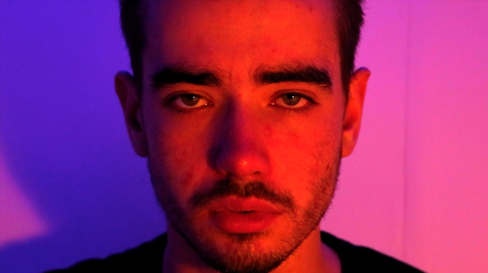
I began by selecting an image of James - I chose the strong portrait shot of him looking down the camera, as I thought that this would be a striking image to use for the cover.

I then traced the elements of his face that I thought would work well for a chunky, modern, graphic aesthetic.


From this tracing, I then cut out these facial features to create a stencil (pictured above). I like this as a design in itself, but I am not going to use it as I want to create something with a range of colours.

Using this stencil, I created this image; I have only used three colours (yellow, blue, pink), but five colours have been created (yellow, blue, pink, orange, green.) This adds to the trippy effect and enhances the tricks that this interference plays on the eyes. 

I like this design as it appears distorted and confuses the eyes. It is also resonant of the design that I used for my inter-titles.

I am planning to experiment with this design with coloured papers before scanning it into Photoshop and working with it digitally.


Tuesday, 12 December 2017

Magazine title

'Nobody knows anything... not one person in the entire motion picture field knows for certain what's going to work. Every time out it's a guess, and, if you're lucky, an educated one'. 

- William Goldman, Adventures in the Screen Trade

My magazine title came from seeing this quote - it made me think that the filmmaking process is full of surprises and accidental ideas, which is amazing as it is not always rigidly formulaic, and therefore allows creativity to shine through.

I also like this quote as it is reassuring that nobody really knows what they are doing! Therefore, I thought 'Mug's Game' would be a witty, satirical name to use - as everybody is really just guessing...


I have chosen to use 'futura' - a modern, sans seriff, lower case font. This is influenced from 'indie', alternative magazines such as 'i-D' and 'the gentlewoman.'
I like this aesthetic as it is simple but bold, and compliments the visuals rather than distracting from them.