Thursday 14 December 2017

Final magazine cover

Here is my final magazine cover. 

In Photoshop I have added a title (I have chosen to change the font to 'Century Gothic'), issue number, date, barcode, price, subtitles, sneak peek of content, and finally... some 3D glasses!

I have also enhanced the vibrancy and contrast of the colours to make them appear more striking.
I have also used the healing brush tool to get rid of a dirty mark on the stencil (I have turned the dirt to white.)


Magazine construction 2

I then began to experiment with the stencil that I had made - I knew I wanted this as the main image, but wanted to add a variety of block colour to make the cover stand out further.

(Please look at my 'magazine influences' post for detailed analysis on my influences.)


I like this aesthetic as it reminiscent of 70s graphics, e.g. David Bowie's Ziggy Stardust.

I then did some further experimentation with the stencil
(however I then decided that I preferred my original design).
Everything here (pictured below) has been done by hand. I have now scanned this into the computer and the rest of the construction will be done on Photoshop.

Magazine construction 1


For my magazine cover, I wanted it to have a homemade look to match the expressionistic, lo-fi mood of my trailer.
I began by selecting an image of James - I chose the strong portrait shot of him looking down the camera, as I thought that this would be a striking image to use for the cover.

I then traced the elements of his face that I thought would work well for a chunky, modern, graphic aesthetic.


From this tracing, I then cut out these facial features to create a stencil (pictured above). I like this as a design in itself, but I am not going to use it as I want to create something with a range of colours.

Using this stencil, I created this image; I have only used three colours (yellow, blue, pink), but five colours have been created (yellow, blue, pink, orange, green.) This adds to the trippy effect and enhances the tricks that this interference plays on the eyes. 

I like this design as it appears distorted and confuses the eyes. It is also resonant of the design that I used for my inter-titles.

I am planning to experiment with this design with coloured papers before scanning it into Photoshop and working with it digitally.


Tuesday 12 December 2017

Magazine title

'Nobody knows anything... not one person in the entire motion picture field knows for certain what's going to work. Every time out it's a guess, and, if you're lucky, an educated one'. 

- William Goldman, Adventures in the Screen Trade

My magazine title came from seeing this quote - it made me think that the filmmaking process is full of surprises and accidental ideas, which is amazing as it is not always rigidly formulaic, and therefore allows creativity to shine through.

I also like this quote as it is reassuring that nobody really knows what they are doing! Therefore, I thought 'Mug's Game' would be a witty, satirical name to use - as everybody is really just guessing...


I have chosen to use 'futura' - a modern, sans seriff, lower case font. This is influenced from 'indie', alternative magazines such as 'i-D' and 'the gentlewoman.'
I like this aesthetic as it is simple but bold, and compliments the visuals rather than distracting from them. 


Mood and Tone

I am aiming to make my trailer in the style of an arthouse film. It will be exploring alternate, distorted states of reality - this will be shown through expressionistic visuals, the strong use of colour giving a trippy and psychedelic atmosphere. This will be helped with motif (reflections) and editing techniques such as superimposition. 

This alternative, lo-fi style is based on films such as Enter the Void, Under the Skin, Trainspotting and Only God Forgives. 

Please look at my research and planning posts on these trailers, as well as my other influences, for notes and detailed analysis.

Example shots:

1. Reflections as motif


These two shots show James looking at his reflection. In psychology, mirrors symbolise the threshold between the conscious and the subconscious mind - so, by looking at his reflection, he is looking towards his unconscious and the altered, distorted place which his mind is in. Whilst doing this, he is attempting to reach the part of his mind which is able to access the information which he has been ordered to find. 

These reflections and mirrors also symbolise James being reflective of himself throughout the film, as this gives an idea of a personal journey as well as a physical one.


2. Superimposition


I have chosen to use a lot of superimposition in my trailer to heighten the sense of confusion and a distorted reality. It makes the audience question what is real and what is not, and portrays James' unhinged, drug-addled mind. 

This also helps to heighten the suspense and tension throughout the trailer, and visually draws the audience in as there is more than one image to look at on the screen. 


Thursday 7 December 2017

Further development to poster

I decided that there needed to be more information on the poster, as it looked too sparse to be a proper billing block image.

I first decided to move the title from the middle of the face and place it on the forehead instead, as the viewer will be able to read the face better (as the nose is not covered, etc.) It is very uncommon for a title to cover the main part of the central image, too.


I then decided that I needed to add some reviews and awards, as the poster would not be complete without it. I have included the same credits that I have included in the actual trailer, and have made them small enough to ensure that the text does not detract from the central image.

Poster 1

I really liked the headshot image that I used in my 3rd experimentation, as well as the red neon glowing title.

However, I needed to change a lot of aspects as it resembled a character poster rather than a main film poster.

I have since added credits (for both the actors, people involved and myself), the slate and the release date.

I have also changed the font of the tagline to something more slick and modern, and have decided to place it centrally. I have moved the title into the middle of the image to give a larger impact.

I have enlarged the image slightly in order for James's face to fit the page better. This also makes the poster look more intense and dramatic.


Poster experimentation 3


- After being unsure whether I wanted to use a central horizontal image, I have taken a separate head shot of James, using a similar colour palette. I like the vertical image rather than the horizontal - it feels more authentic.

- Taking influence from the Stranger Things 2 posters, I have included a tagline across the face as well as the release date in the bottom corner, which I think works well.

- The title itself is a problem - photoshop is not allowing me to copy and paste my red neon title which I have created. (Pictured below.) The font on the poster appears too dark and flat, and does not seem to match the rest of the image.


- I have since managed to put this text into the image. I have changed the sizing slightly, and have added a credit. I really like the look of this character poster, but I need to create something which allows more information to be gathered from it.


Poster experimentation 2


- After (reluctantly) deciding to scrap the 60s graphics, I have experimented with a more 'modern' look in order to match the aesthetic of my trailer.

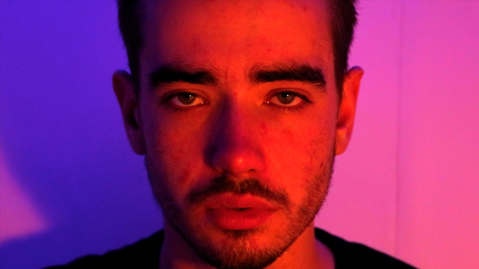
- I have used the same image of James (and, again, enhanced the colours) and have superimposed this on top of a still from my shoot in China Town. I chose to use this image as it includes neon lights which read 'Play 2 Win' and 'Amusements'.

- The colouring is strong and it works very well, as it goes from blue to pink. This could be seen as a suggestion of the left and right side of the brain, and the way that they work differently.

- I then superimposed, twice, the image of James onto the left and right hand sides of the frame. I have done this in order to show disorientation and a suggestion of altered ways of thinking. The three heads also adds further layers of interest to the image - they are not instantly seen and the viewer therefore has to study the poster before they are noticed.


- I experimented with the same font as the previous design, as I thought the contrast between old and new would be interesting. Again, however, the font does not match the one that I have used throughout the trailer (and therefore can't be used).

- I then experimented in Microsoft Word with my original font. I wanted to make it look like neon lights, similar to those in the image from China Town. This neon glow enhances the modern look of the poster.

- However, I do not really like this design that much as I think it is very generic and I feel as if this does not ring true to my trailer. It looks like it could be a poster for a blockbuster, but I want my poster to look more artistic and alternative.

- I am also not sure whether I want my poster to be a horizontal image.


Poster experimentation 1


- I love the aesthetic of 60's psychedelic patterns, and so I selected samples of them and placed them on this image of James. Here are some of the patterns that caught my eye when researching:

- I love the bright colours that are used, and I wanted to incorporate these vibrant block colours to create a poster that is funky and eye catching, whilst also giving a nod to the origins of LSD and hallucinogenics.

- I have used lines from the fourth image on this experimentation. I have resized and rotated these to create a new pattern.

- I chose this image of James as it is centrally framed, and his eyes looking down the camera. The colouring is very strong, with blue on the left and pink on the right. His face appears red and striking, which is strong and perfect for a poster. The space around the edge  allows for elements to be added.

- I have enhanced the colours in the image of James for an even more dramatic effect.

- I have used the font from the 1967 film 'The Trip', as it matches the style of the patterns. The white is striking on top of the rest of the vibrant colour.


- However, I am not going to use this design for my poster, as the aesthetic is too 'old'. My trailer is very modern, and therefore this poster is not coherent to my film. The visual references to the 60s does not match, and is therefore irrelevant.

- Also, the font I have used does not match the font that I have used throughout my trailer. Therefore I cannot use the font I have chosen here (as they must match).